With the announcement of the Atlanta Braves new Nike City Connect uniforms, it felt like the perfect time to take a step back and appreciate the franchise’s visual history. Since moving to Atlanta in 1966, the Braves have worn some of the most recognizable and iconic uniforms in Major League Baseball. Some designs were bold risks, others were timeless classics but each one represents a specific era in Braves baseball.
This list isn’t just about aesthetics. It’s about identity, nostalgia, and moments that defined the franchise. From Hank Aaron’s historic swing to modern-day contenders, these uniforms tell the story of the Atlanta Braves.
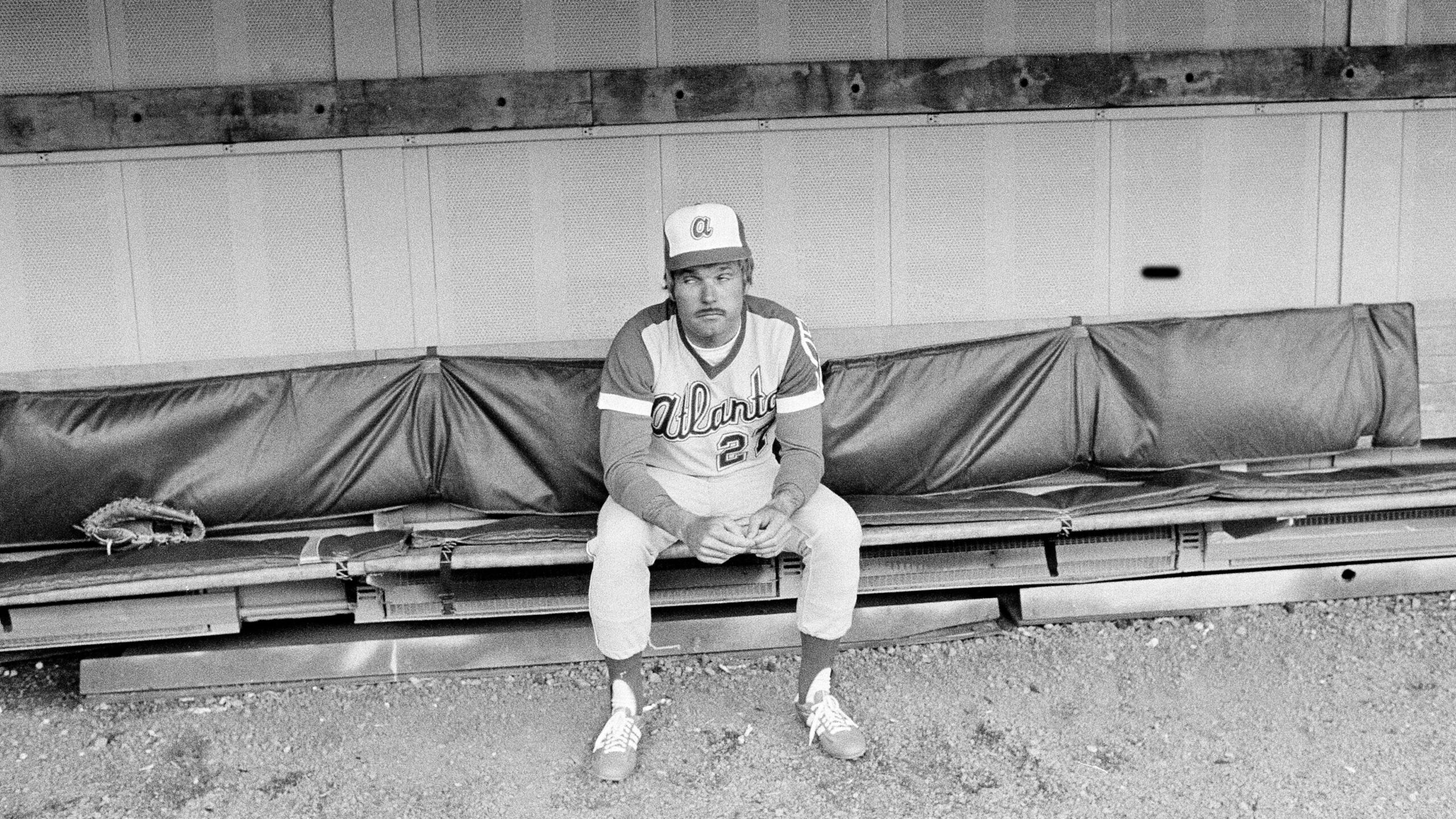
10. Primary Home (1980–1986)
These uniforms were a Ted Turner staple. While the look didn’t last long, its impact shouldn’t be overlooked. Turner wanted the Braves to stand out, and this design did exactly that. The bold style helped establish a visual identity during a time when the franchise was still finding its footing in Atlanta. Even today, you can see hints of this era in modern designs, especially with the previous City Connect concepts. It may not be the cleanest look in team history, but it represents a turning point for the organization.
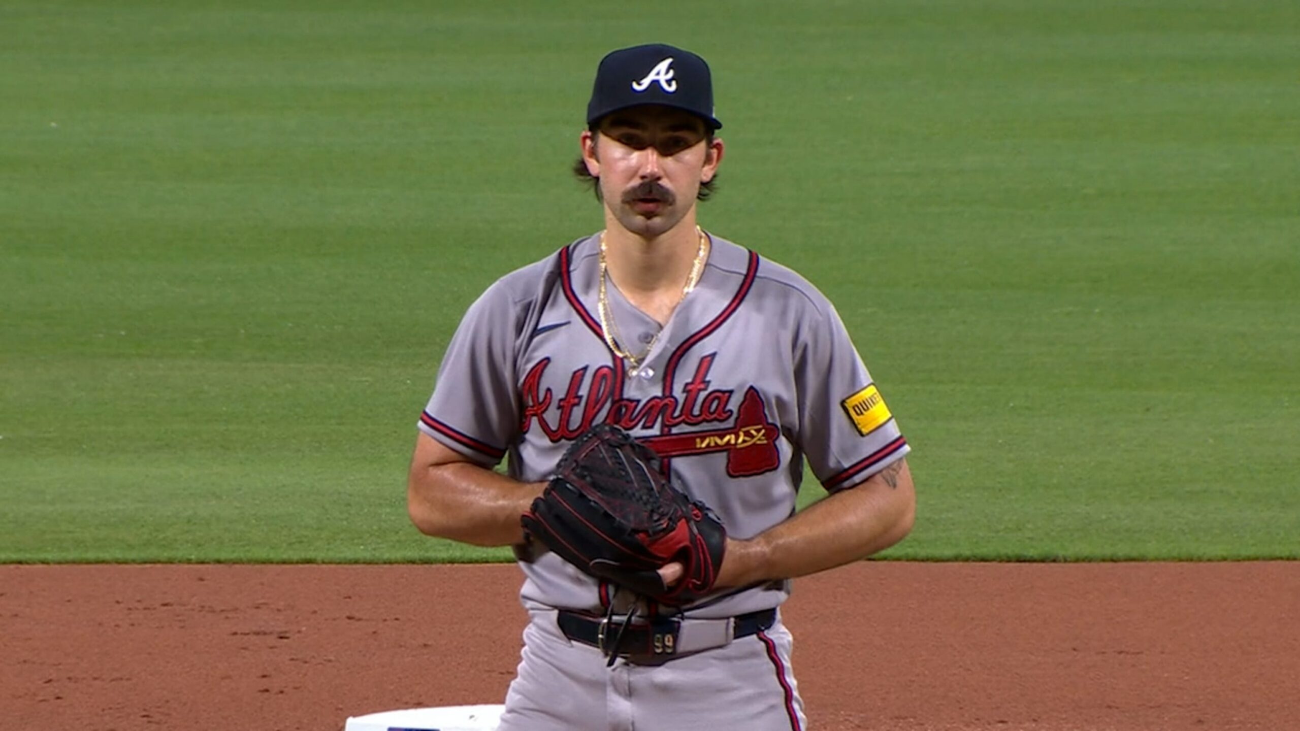
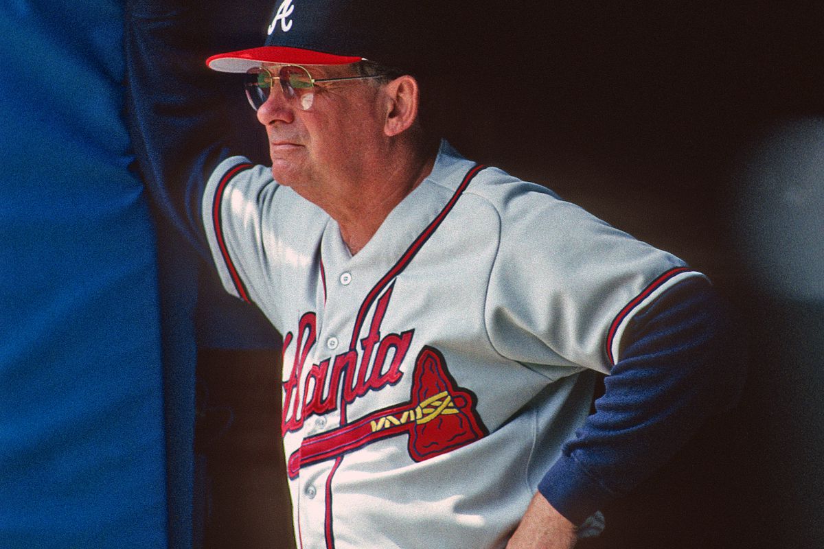
9. Navy Road Alternates (2008–2019)
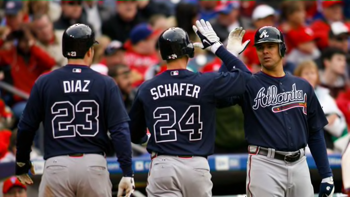
In 2008, the Braves introduced their first true road alternate uniform, breaking away from the traditional gray look. This was a major shift. For the first time, Atlanta embraced variation on the road, and it worked. The navy jerseys paired with white lettering and outlined numbers created a sharp, modern look that stayed in rotation for over a decade. These uniforms became a consistent part of the Braves’ identity during the late 2000s and 2010s.
8. Home Pinstripes (1968–1971)
:max_bytes(150000):strip_icc():focal(899x79:901x81)/phil-niekro-1307ab5da4b642efaf8a135e3bcdff07.jpg)
Only worn for three seasons, these pinstriped uniforms remain one of the more unique looks in Braves history. Featuring the uppercase “A” cap and clean navy script, the design had clear inspiration from classic baseball aesthetics, but still maintained a Braves identity. There’s something about pinstripes that immediately adds a sense of tradition. Even though the Braves didn’t stick with this look long-term, it remains one of the more underrated uniforms the team has ever worn.
7. Road Powder Blues (1980–1986)
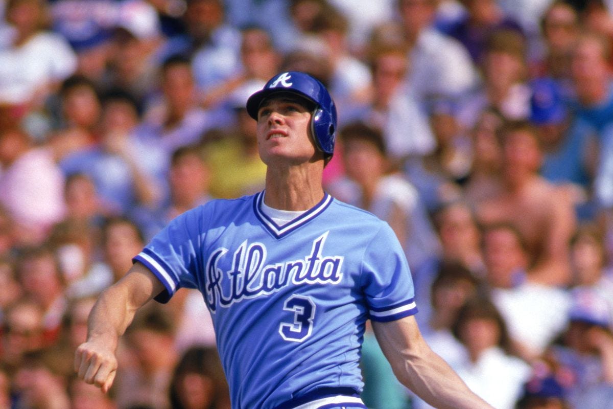
These powder blue uniforms are a fan favorite and for good reason. They represent a classic era of baseball where teams weren’t afraid to experiment with color. That said, compared to other powder blue designs, this version lacks some of the contrast that would push it higher on the list. The absence of red accents, along with the matching blue pants and no belt holds it back slightly, but it’s still one of the most recognizable looks from that era.
6. Home Whites (1972–1975)
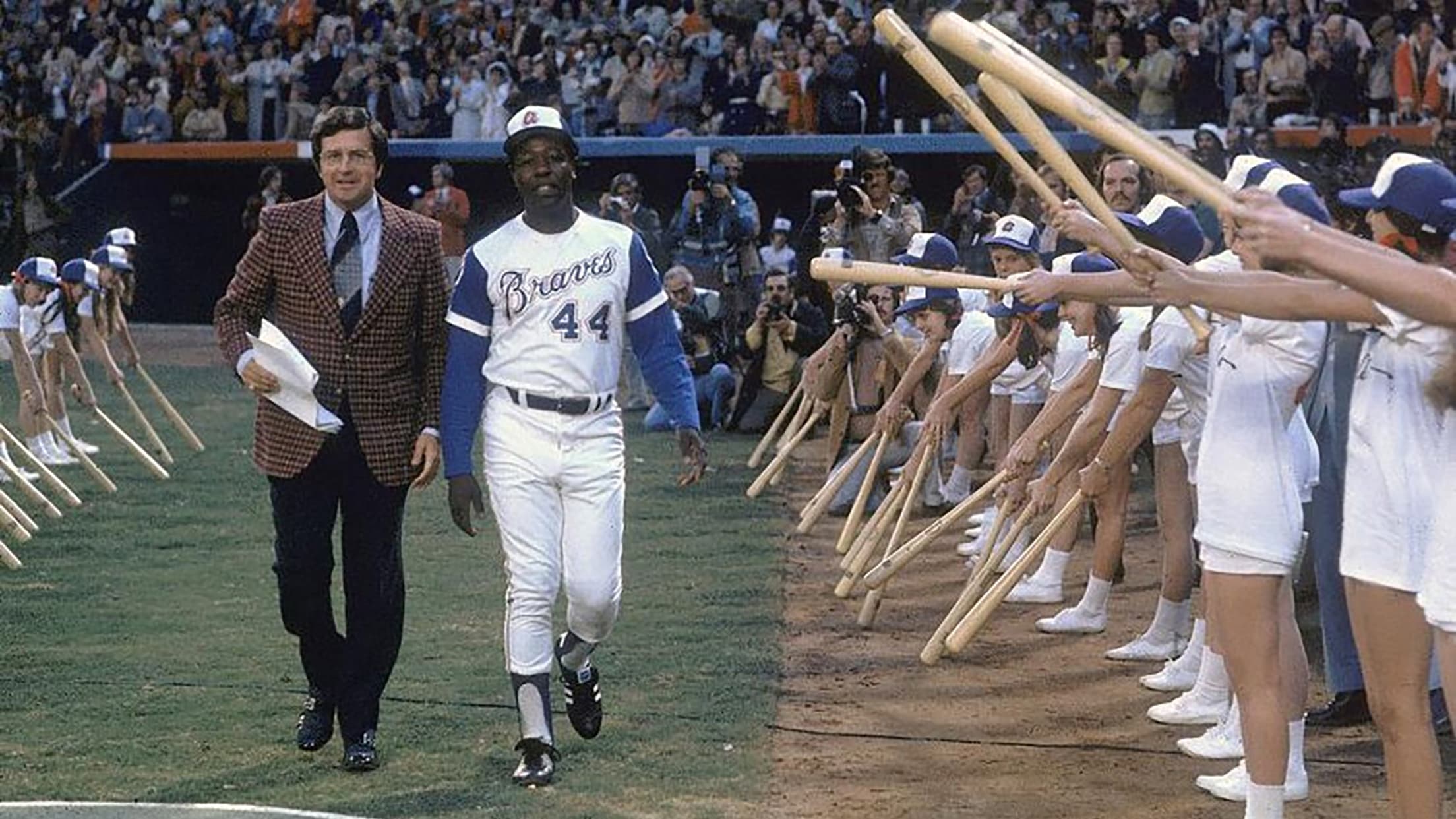
This uniform is forever tied to one moment: Hank Aaron’s 715th home run. That alone gives it legendary status. The lowercase “a,” feather detailing, and overall simplicity make this one of the cleanest vintage designs the Braves have ever worn. It’s not just a uniform, it’s a piece of baseball history.
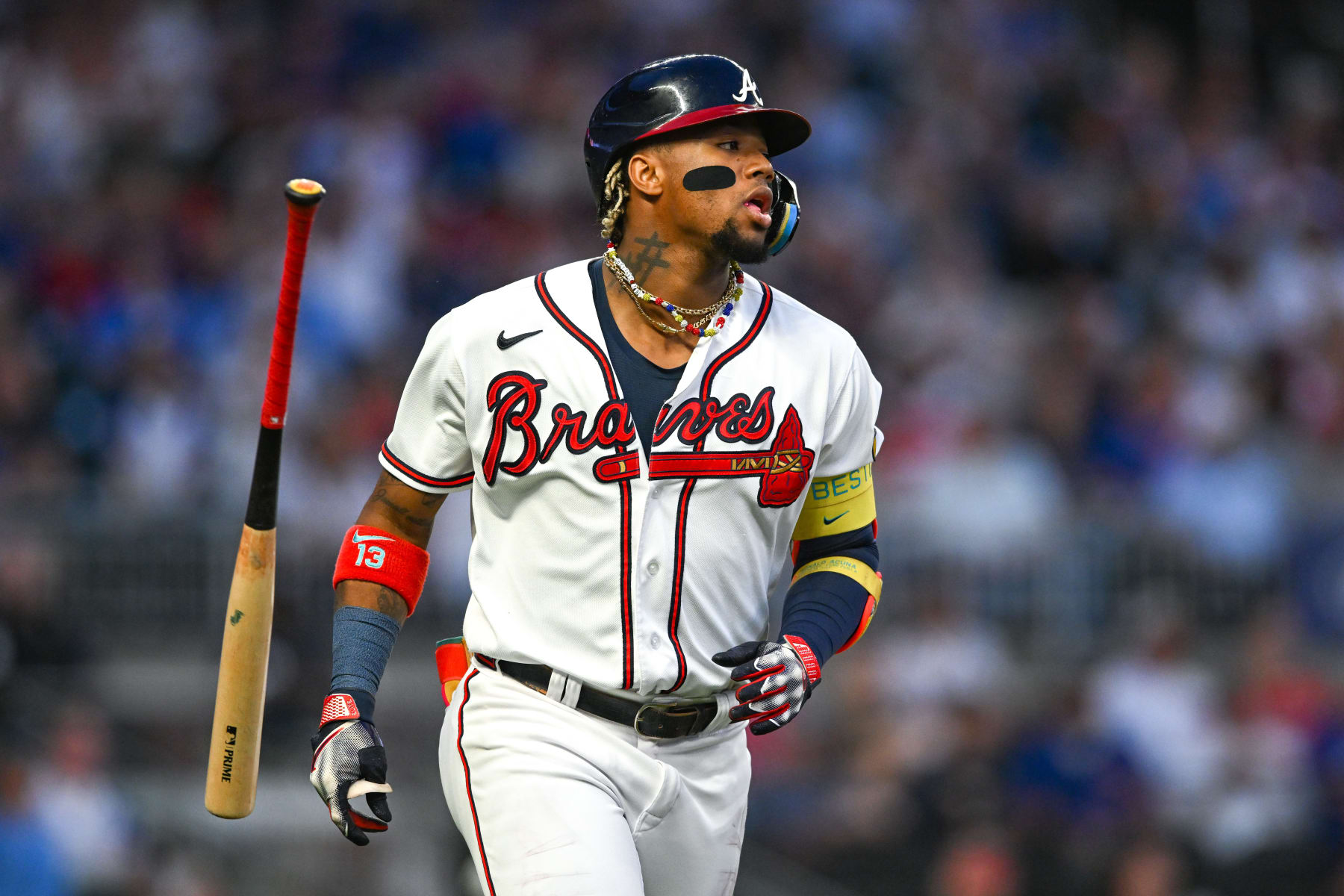
5. Navy Road Alternates (2019–Present)

The modern evolution of the navy road uniforms improves on the original in all the right ways. The addition of red piping, a cleaner tomahawk design, and improved color balance gives this version a more complete feel. While the red cap is limited to Spring Training, it arguably enhances the look even more compared to the typical all navy away lid. This uniform strikes a strong balance between modern design and traditional Braves branding.
4. Sunday Cream (2012–2021)

There’s something different about these uniforms and that’s exactly why they work. The off-white “cream” color immediately separates them from the standard home whites. Worn primarily on Sundays, these jerseys became a fan favorite over time. They brought a relaxed, almost vintage feel to the field while still looking sharp and modern. It’s surprising they’re no longer in the rotation.
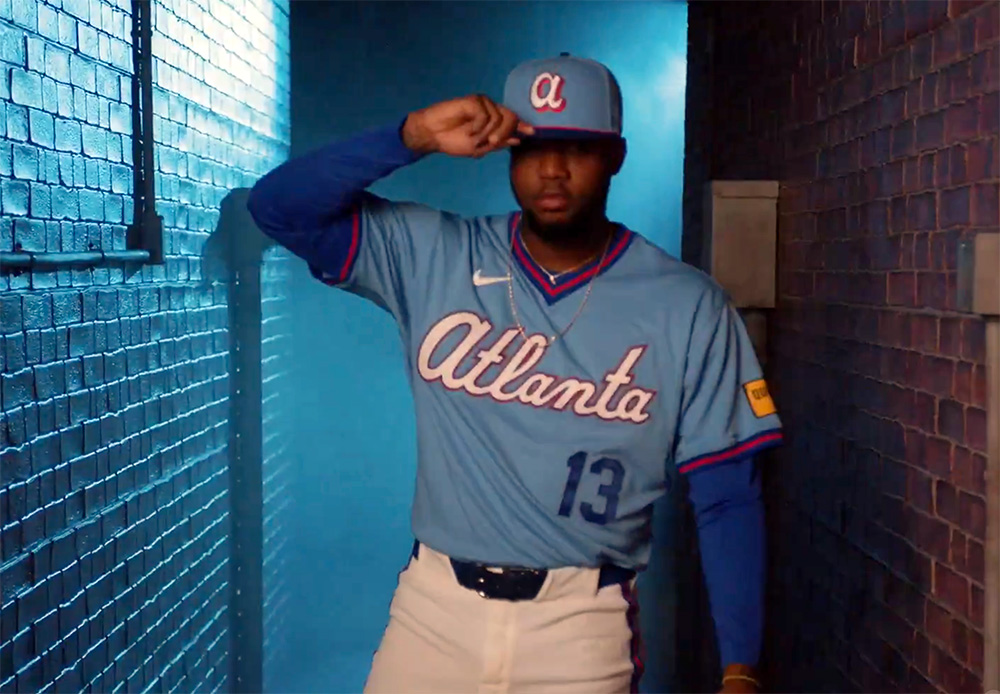
3. City Connect (2023–2025)

You either love them or hate them, but there’s no denying these uniforms made an impact. The Braves first City Connect uniforms leaned heavily into bold colors and retro inspiration. While some elements particularly the hat and helmet felt slightly off, the overall design brought something new and different to the franchise. These uniforms weren’t meant to be traditional. They were meant to stand out, and they accomplished exactly that.
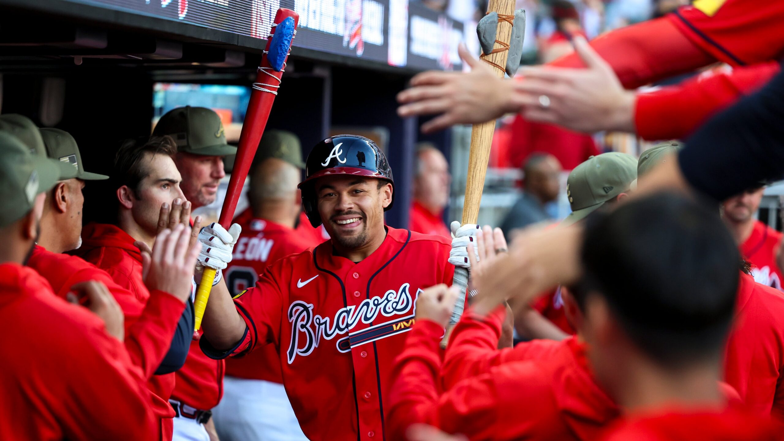
2. Red Alternates (2005–Present)

Few uniforms in baseball are as instantly recognizable as the Braves’ red alternates. Since their original introduction in 2005, they’ve gone through multiple variations, but the core identity has remained the same loud, confident, and unmistakably Atlanta. The red jerseys pop in a way few others do, making them a staple of the Braves’ rotation. Originally worn on Sundays, they eventually transitioned into Friday night uniforms, further cementing their place in team tradition.
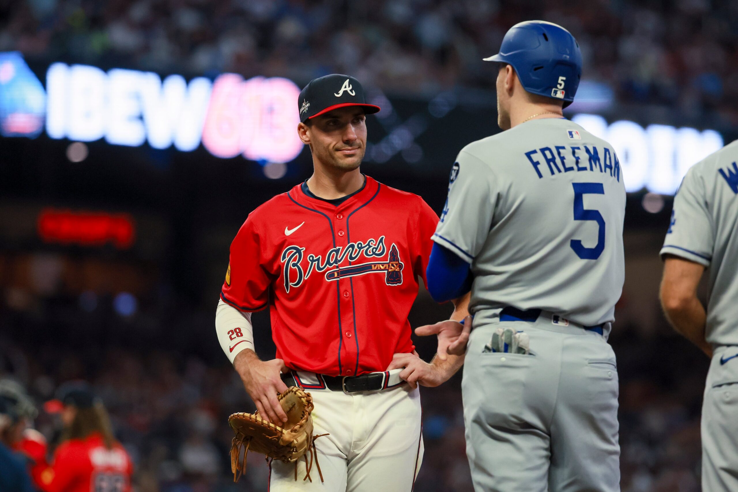
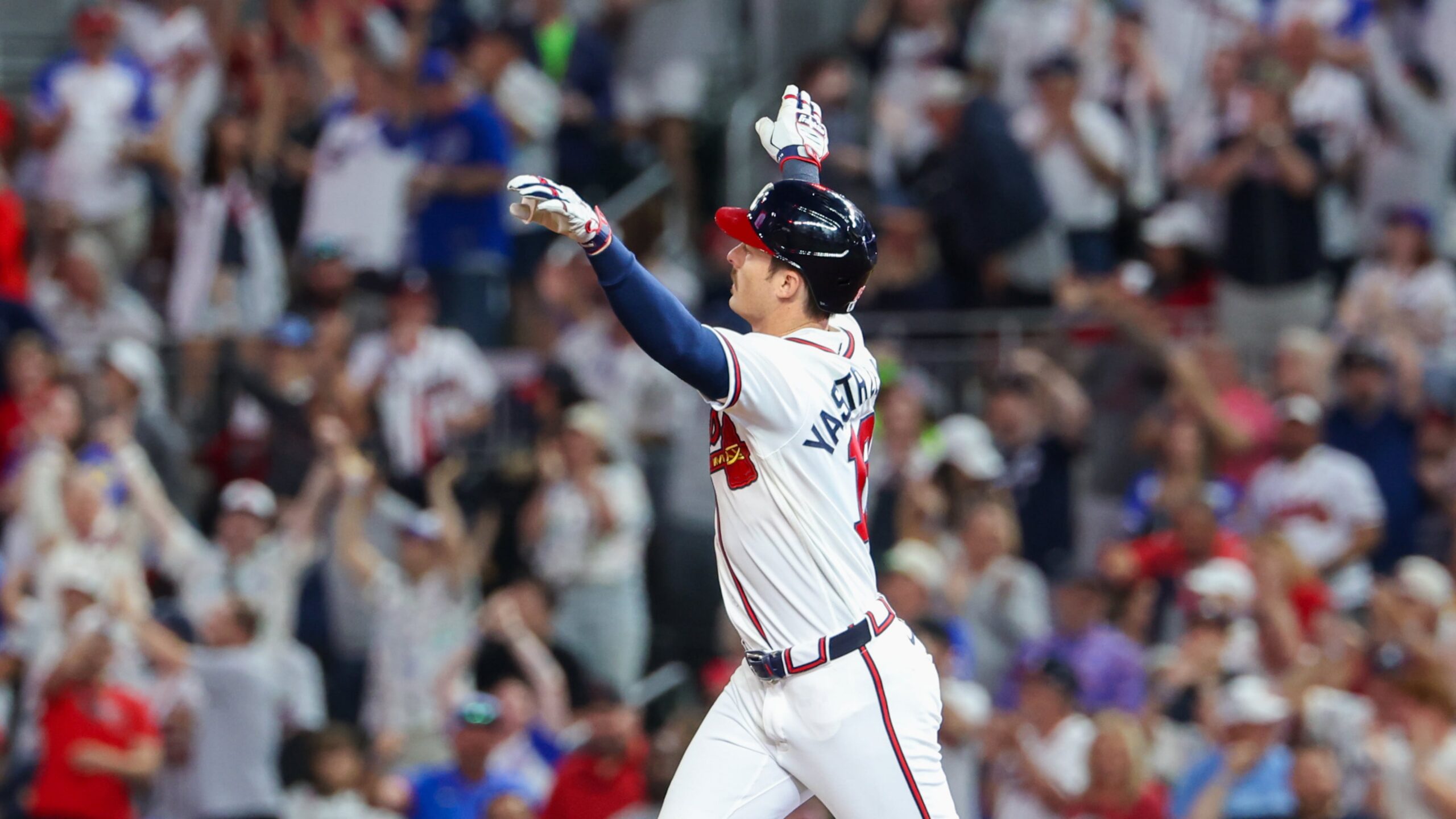
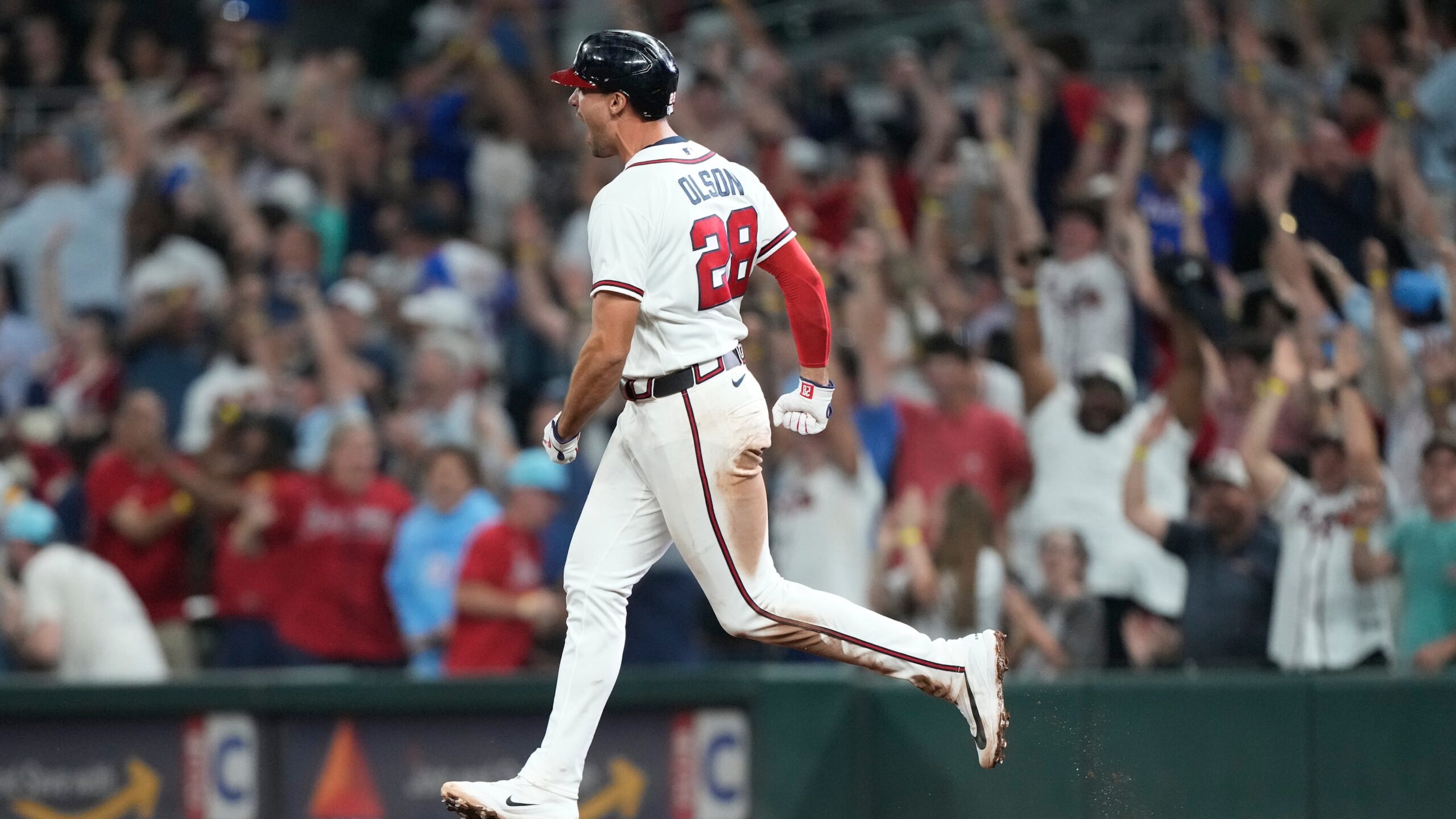
1. All-White Home Uniforms (1987–Present)
This is the standard. The benchmark. The uniform that defines the Atlanta Braves. Since 1987, the all-white home uniforms have remained largely unchanged and for good reason. The balance of red, navy, and white is perfect. The script is iconic. The overall look is timeless. When you picture the Braves and their championship teams, this is what you see.
Final Thoughts
The Atlanta Braves have built one of the most recognizable visual identities in baseball. From bold experiments to timeless classics, each uniform represents a different chapter in the team’s history. What makes this list special isn’t just the designs themselves, it’s the moments attached to them. Championships, milestones, and unforgettable players all contribute to what these uniforms represent. As new designs continue to be introduced, one thing remains clear: no matter how much changes, the core identity of the Atlanta Braves will always stand out.